> ## Documentation Index
> Fetch the complete documentation index at: https://docs.praxis-ai.com/llms.txt
> Use this file to discover all available pages before exploring further.
# UI Customization
> Learn how to customize the user interface of your instance using CSS classes.
You can further customize your instance by applying a CSS theme to your instance.
This enables you to change backgrounds, colors, sizes, and layouts across the entire digital twin UI.
Under the **Personalization and AI Models** tab in your admin dashboard, you will find the **UI CSS** field.
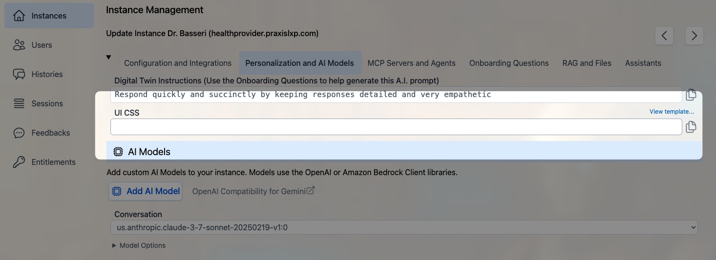 The starter template CSS file is available using this link:
[https://pria.praxislxp.com/pria-ui-template.css](https://pria.praxislxp.com/pria-ui-template.css)
Copy its content into the CSS field, and click **Update** to save.
## Responsive Breakpoints
When writing custom CSS, use the following media queries for responsive layouts:
```css theme={null}
max-sm @media not all and (min-width: 640px) { ... }
max-md @media not all and (min-width: 768px) { ... }
max-lg @media not all and (min-width: 1024px) { ... }
max-xl @media not all and (min-width: 1280px) { ... }
max-2xl @media not all and (min-width: 1536px) { ... }
```
## CSS Class Reference
Every customizable CSS class available in the Pria UI, organized by section.
### Global
| Class | Used In | Purpose |
| --------------------- | -------------- | ----------------------------------------------------- |
| `.pria-ui-background` | Main layout | Root background container for the entire application |
| `.pria-ui-template` | Admin settings | Reference to the CSS template file (link in admin UI) |
### Top Navigation Bar
| Class | Used In | Purpose |
| --------------------------- | ------- | ---------------------------------------------------------------- |
| `.pria-ui-topbar` | Top bar | Main navigation bar across the top of the screen |
| `.pria-ui-top-btn` | Top bar | Individual navigation buttons (Home, Admin, Credits, etc.) |
| `.pria-ui-favorites-bar` | Top bar | Horizontal scrollable bar of favorite institution shortcuts |
| `.pria-top-navigation-menu` | Top bar | Profile dropdown menu that appears when clicking the user avatar |
### Sidebar / Conversation List
| Class | Used In | Purpose |
| ------------------------------- | --------------- | ---------------------------------------------------------------------- |
| `.pria-ui-sidebar` | Sidebar | Left sidebar panel listing conversations |
| `.pria-ui-sidebar-close` | Sidebar | Close button to collapse the sidebar |
| `.pria-ui-sidebar-search` | Sidebar | Search input field for filtering conversations |
| `.pria-ui-conversation-current` | Sidebar | Highlight style on the currently active conversation |
| `.pria-ui-course-name` | Message headers | Inline display showing the conversation/course name with bookmark icon |
### Main Content Area
| Class | Used In | Purpose |
| ------------------- | ---------- | ------------------------------------------------------ |
| `.pria-ui-main` | Main panel | Primary content area to the right of the sidebar |
| `.pria-ui-messages` | Messages | Scrollable container holding all conversation messages |
### Messages
| Class | Used In | Purpose |
| ---------------------------- | --------------- | ----------------------------------------------------------------- |
| `.pria-ui-message` | Messages | Wrapper for an individual message (input + output pair) |
| `.pria-message-in` | Messages | User's input message text block |
| `.pria-message-out` | Messages | AI's output message text block |
| `.pria-ui-input-icon` | Messages | Container for the user avatar icon beside input messages |
| `.pria-ui-output-icon` | Messages | Container for the AI/assistant avatar icon beside output messages |
| `.pria-ui-assistant-name` | Message headers | Inline display of assistant name with sparkles icon |
| `.pria-ui-dialogue-created` | Message headers | Expandable timestamp showing when the dialog was created |
| `.pria-ui-dialogue-favorite` | Message headers | Star button to toggle a dialog as favorite |
| `.pria-ui-dialog-infocard` | Messages | Hover card showing dialog metadata (tokens, credits, duration) |
### Message Toolbar
| Class | Used In | Purpose |
| ------------------------------- | --------------- | ----------------------------------------------------------- |
| `.pria-message-tools` | Message toolbar | Outer container for the per-message action bar |
| `.pria-ui-tools-btn` | Message toolbar | Base class on every tool button (share, view, delete, copy) |
| `.pria-ui-tools-tooltip` | Message toolbar | Tooltip label that appears on hover above each button |
| `.pria-ui-tools-check` | Message toolbar | Checkmark icon shown briefly after a successful copy |
| `.pria-ui-tools-share-btn` | Message toolbar | Share Link button wrapper |
| `.pria-ui-tools-share` | Message toolbar | Share Link icon |
| `.pria-ui-tools-view-btn` | Message toolbar | View Details button wrapper |
| `.pria-ui-tools-view` | Message toolbar | View Details icon |
| `.pria-ui-tools-delete-btn` | Message toolbar | Delete Dialog button wrapper |
| `.pria-ui-tools-delete` | Message toolbar | Delete / Recover icon |
| `.pria-ui-tools-copyinput-btn` | Message toolbar | Copy Input button wrapper |
| `.pria-ui-tools-copyinput` | Message toolbar | Copy Input icon |
| `.pria-ui-tools-copyoutput-btn` | Message toolbar | Copy Output button wrapper |
| `.pria-ui-tools-copyoutput` | Message toolbar | Copy Output icon |
| `.pria-ui-tools-confirm` | Message toolbar | Delete confirmation bar (are you sure?) |
| `.pria-ui-tools-confirm-yes` | Message toolbar | Confirm delete button |
| `.pria-ui-tools-confirm-cancel` | Message toolbar | Cancel delete button |
### Text-to-Speech
| Class | Used In | Purpose |
| --------------------------- | --------------- | ------------------------------------------ |
| `.pria-ui-tools-tts` | Message toolbar | Wrapper for all TTS controls |
| `.pria-ui-tools-speak` | Message toolbar | Speak button (starts text-to-speech) |
| `.pria-ui-tools-speak-icon` | Message toolbar | Speaker icon inside the Speak button |
| `.pria-ui-tools-stop` | Message toolbar | Stop button (stops playback) |
| `.pria-ui-tools-stop-icon` | Message toolbar | Stop icon inside the Stop button |
| `.pria-ui-tools-voice` | Message toolbar | Voice selector button |
| `.pria-ui-tools-voice-icon` | Message toolbar | Music note icon inside the Voice button |
| `.pria-ui-tools-voice-name` | Message toolbar | Voice name label (hidden on small screens) |
### Input Area
| Class | Used In | Purpose |
| ------------------------ | ------------- | ------------------------------------------------------------------ |
| `.pria-ui-input` | Input area | Main input section at the bottom of the conversation |
| `.pria-ui-entrysearch` | Input area | The text input/search field where users type messages |
| `.pria-ui-tb-btn` | Input toolbar | Toolbar buttons below the input (send, attach, etc.) |
| `.pria-ui-dictate-btn` | Input area | Microphone button for voice input/dictation |
| `.pria-ui-input-options` | Input area | Collapsible container for input options (file upload, paste, etc.) |
| `.pria-ui-embed-uploads` | Input area | Drag-and-drop upload area showing dropped files/URLs |
### Streaming / Live Response
| Class | Used In | Purpose |
| -------------------------- | --------- | ----------------------------------------------------------- |
| `.pria-ui-stream-message` | Streaming | Wrapper for the entire streaming message display |
| `.pria-ui-stream-controls` | Streaming | Container for streaming control buttons (abort, pause) |
| `.pria-ui-rtstream` | Streaming | Real-time audio stream container for live conversation |
| `.pria-ui-rtstream-icon` | Streaming | Pulsing status indicator icon during active RT audio stream |
### Welcome Screen
| Class | Used In | Purpose |
| -------------------------- | ------- | ------------------------------------------------------- |
| `.pria-ui-welcome` | Welcome | Welcome screen displayed when no conversation is active |
| `.pria-ui-welcome-options` | Welcome | Suggested prompt buttons/options on the welcome screen |
### Zoom Controls
| Class | Used In | Purpose |
| ------------------ | -------- | ------------------------------------- |
| `.pria-ui-zoomin` | Messages | Zoom in button for message text size |
| `.pria-ui-zoomout` | Messages | Zoom out button for message text size |
### Assistants
| Class | Used In | Purpose |
| -------------------------------- | ---------------- | --------------------------------------------------------------------- |
| `.pria-ui-assistants` | Assistants panel | Outer container for the assistants section |
| `.pria-ui-assistants-list` | Assistants panel | Responsive grid container for displaying assistant cards |
| `.pria-ui-assistant` | Assistants panel | Individual assistant card |
| `.pria-ui-assistant.active` | Assistants panel | Active (published and enabled) assistant card |
| `.pria-ui-assistant.inactive` | Assistants panel | Inactive (disabled) assistant card |
| `.pria-ui-assistant.unpublished` | Assistants panel | Unpublished (draft) assistant card |
| `.pria-ui-assistant-name` | Message headers | Assistant name display with sparkles icon in message headers |
| `.pria-ui-assistant-badges` | Assistants panel | Container for scope, status, and permission badges on assistant cards |
| `.pria-ui-assistant-actions` | Assistants panel | Container for start/edit/delete action buttons on assistant cards |
| `.pria-ui-assistant-model` | Assistants panel | Modal container for adding/editing assistant settings |
### Voices / Language Selection
| Class | Used In | Purpose |
| ------------------------------ | --------------- | --------------------------------------- |
| `.pria-ui-voices` | Voices panel | Container for voice selection options |
| `.pria-ui-languages-selection` | Languages panel | Container for language/locale selection |
### Files / Uploads
| Class | Used In | Purpose |
| ------------------------------- | ------------- | ----------------------------------------------------------- |
| `.pria-ui-files` | Files panel | Outer container for the files section |
| `.pria-ui-files-sort` | Files toolbar | Sort buttons (by name or date) in the files toolbar |
| `.pria-ui-file` | Files panel | Individual file card |
| `.pria-ui-file.selected` | Files panel | Currently selected file card |
| `.pria-ui-file.active` | Files panel | Active (included in context) file card |
| `.pria-ui-file.inactive` | Files panel | Inactive (excluded from context) file card |
| `.pria-ui-file.error` | Files panel | File card in error state (failed processing) |
| `.pria-ui-collection` | Files panel | Collection (folder) card in the files view |
| `.pria-ui-uploads` | Files panel | Container for file upload area |
| `.pria-ui-vault-health-summary` | Files panel | Stats chips showing total, included, and unused file counts |
### Gallery (Digital Twins)
| Class | Used In | Purpose |
| -------------------------------- | ------- | --------------------------------------------- |
| `.pria-ui-gallery` | Gallery | Outer container for the digital twins gallery |
| `.pria-ui-gallery-header` | Gallery | Header section of the gallery |
| `.pria-ui-gallery-carousel` | Gallery | Scrollable carousel of digital twin cards |
| `.pria-ui-gallery-card` | Gallery | Individual digital twin card |
| `.pria-ui-gallery-card.selected` | Gallery | Currently selected digital twin card |
### Realtime / Conversation Mode
| Class | Used In | Purpose |
| ----------------------------- | -------- | ---------------------------------------------------------------------------------------------------------------- |
| `.pria-ui-rt-window` | RT Audio | Draggable floating window for real-time audio conversation |
| `.pria-ui-convo-container` | RT Audio | Inner circular container holding the animated avatar with status colors. Contains also contracted/expanded class |
| `.pria-ui-convo-tools` | RT Audio | Bottom container holding the tools. Contains also contracted/expanded class |
| `.pria-ui-convo-avatar-image` | RT Audio | The avatar image element inside the RT audio window |
| `.pria-ui-convo-tools-panel` | RT Audio | Bottom tools panel inside the RT audio window |
| `.pria-ui-rt-idle` | RT Audio | State class: no active audio (default) |
| `.pria-ui-rt-input-active` | RT Audio | State class: user is speaking (mic input detected) |
| `.pria-ui-rt-output-active` | RT Audio | State class: AI is speaking (audio output active) |
| `.pria-ui-rt-muted` | RT Audio | State class: microphone is muted |
### Pricing Page
| Class | Used In | Purpose |
| ------------------------------- | ------- | --------------------------------------------- |
| `.pria-ui-pricing-header` | Pricing | Header section of the pricing page |
| `.pria-ui-pricing-container` | Pricing | Main container for pricing plans |
| `.pria-ui-pricing-loading` | Pricing | Loading state placeholder |
| `.pria-ui-pricing-modal` | Pricing | Payment modal dialog |
| `.pria-ui-pricing-tabs` | Pricing | Tab bar for switching between pricing views |
| `.pria-ui-pricing-actions` | Pricing | Action buttons (subscribe, buy credits, etc.) |
| `.pria-ui-pricing-about-header` | Pricing | Header for the "about" section |
| `.pria-ui-pricing-about` | Pricing | About/description section on the pricing page |
| `.pria-ui-pricing-badges` | Pricing | Badge display area on the pricing page |
### Badges / Tags
These classes are reserved for future use and available for custom styling of badge elements.
| Class | Used In | Purpose |
| --------------------------- | ------- | ------------------------- |
| `.pria-ui-badge` | Badges | Generic badge/tag element |
| `.pria-ui-badge-membership` | Badges | Membership level badge |
| `.pria-ui-badge-role` | Badges | User role badge |
| `.pria-ui-badge-credits` | Badges | Credits count badge |
| `.pria-ui-badge-pool` | Badges | Pool credits badge |
| `.pria-ui-badge-sharing` | Badges | Sharing status badge |
### Charts / Visualization
| Class | Used In | Purpose |
| ------------------------- | ------- | -------------------------------------------- |
| `.pria-ui-chartcontainer` | Charts | Container for chart/visualization components |
### Admin Section
| Class | Used In | Purpose |
| --------------------- | ------------ | -------------------------------------------- |
| `.pria-ui-wrapper` | Admin | Outer wrapper for admin page content |
| `.pria-ui-tabpane` | Admin | Content pane for admin tab sections |
| `.pria-ui-button-bar` | Admin / Tabs | Horizontal tab bar or button group container |
### Profile Section
| Class | Used In | Purpose |
| ------------------------- | ------- | --------------------------------------- |
| `.pria-ui-profile-header` | Profile | Header section of the user profile page |
### Feedback / Output
| Class | Used In | Purpose |
| ------------------- | -------- | ----------------------------------------- |
| `.pria-ui-feedback` | Feedback | Container for the feedback/review section |
| `.pria-ui-output` | Output | Generic output display container |
### Error Display
| Class | Used In | Purpose |
| ------------------------ | ------------ | ----------------------------------------------------------- |
| `.pria-ui-error` | Error banner | Outer wrapper for error notification banners |
| `.pria-ui-error-inner` | Error banner | Inner container with gradient background and border styling |
| `.pria-ui-error-icon` | Error banner | Container for the error exclamation icon |
| `.pria-ui-error-message` | Error banner | Text content area of the error message |
| `.pria-ui-error-dismiss` | Error banner | Dismiss/close button to hide the error |
### Collapsible Sections
| Class | Used In | Purpose |
| ------------------ | ----------- | --------------------------------------------------------------- |
| `.pria-ui-details` | Collapsible | `
The starter template CSS file is available using this link:
[https://pria.praxislxp.com/pria-ui-template.css](https://pria.praxislxp.com/pria-ui-template.css)
Copy its content into the CSS field, and click **Update** to save.
## Responsive Breakpoints
When writing custom CSS, use the following media queries for responsive layouts:
```css theme={null}
max-sm @media not all and (min-width: 640px) { ... }
max-md @media not all and (min-width: 768px) { ... }
max-lg @media not all and (min-width: 1024px) { ... }
max-xl @media not all and (min-width: 1280px) { ... }
max-2xl @media not all and (min-width: 1536px) { ... }
```
## CSS Class Reference
Every customizable CSS class available in the Pria UI, organized by section.
### Global
| Class | Used In | Purpose |
| --------------------- | -------------- | ----------------------------------------------------- |
| `.pria-ui-background` | Main layout | Root background container for the entire application |
| `.pria-ui-template` | Admin settings | Reference to the CSS template file (link in admin UI) |
### Top Navigation Bar
| Class | Used In | Purpose |
| --------------------------- | ------- | ---------------------------------------------------------------- |
| `.pria-ui-topbar` | Top bar | Main navigation bar across the top of the screen |
| `.pria-ui-top-btn` | Top bar | Individual navigation buttons (Home, Admin, Credits, etc.) |
| `.pria-ui-favorites-bar` | Top bar | Horizontal scrollable bar of favorite institution shortcuts |
| `.pria-top-navigation-menu` | Top bar | Profile dropdown menu that appears when clicking the user avatar |
### Sidebar / Conversation List
| Class | Used In | Purpose |
| ------------------------------- | --------------- | ---------------------------------------------------------------------- |
| `.pria-ui-sidebar` | Sidebar | Left sidebar panel listing conversations |
| `.pria-ui-sidebar-close` | Sidebar | Close button to collapse the sidebar |
| `.pria-ui-sidebar-search` | Sidebar | Search input field for filtering conversations |
| `.pria-ui-conversation-current` | Sidebar | Highlight style on the currently active conversation |
| `.pria-ui-course-name` | Message headers | Inline display showing the conversation/course name with bookmark icon |
### Main Content Area
| Class | Used In | Purpose |
| ------------------- | ---------- | ------------------------------------------------------ |
| `.pria-ui-main` | Main panel | Primary content area to the right of the sidebar |
| `.pria-ui-messages` | Messages | Scrollable container holding all conversation messages |
### Messages
| Class | Used In | Purpose |
| ---------------------------- | --------------- | ----------------------------------------------------------------- |
| `.pria-ui-message` | Messages | Wrapper for an individual message (input + output pair) |
| `.pria-message-in` | Messages | User's input message text block |
| `.pria-message-out` | Messages | AI's output message text block |
| `.pria-ui-input-icon` | Messages | Container for the user avatar icon beside input messages |
| `.pria-ui-output-icon` | Messages | Container for the AI/assistant avatar icon beside output messages |
| `.pria-ui-assistant-name` | Message headers | Inline display of assistant name with sparkles icon |
| `.pria-ui-dialogue-created` | Message headers | Expandable timestamp showing when the dialog was created |
| `.pria-ui-dialogue-favorite` | Message headers | Star button to toggle a dialog as favorite |
| `.pria-ui-dialog-infocard` | Messages | Hover card showing dialog metadata (tokens, credits, duration) |
### Message Toolbar
| Class | Used In | Purpose |
| ------------------------------- | --------------- | ----------------------------------------------------------- |
| `.pria-message-tools` | Message toolbar | Outer container for the per-message action bar |
| `.pria-ui-tools-btn` | Message toolbar | Base class on every tool button (share, view, delete, copy) |
| `.pria-ui-tools-tooltip` | Message toolbar | Tooltip label that appears on hover above each button |
| `.pria-ui-tools-check` | Message toolbar | Checkmark icon shown briefly after a successful copy |
| `.pria-ui-tools-share-btn` | Message toolbar | Share Link button wrapper |
| `.pria-ui-tools-share` | Message toolbar | Share Link icon |
| `.pria-ui-tools-view-btn` | Message toolbar | View Details button wrapper |
| `.pria-ui-tools-view` | Message toolbar | View Details icon |
| `.pria-ui-tools-delete-btn` | Message toolbar | Delete Dialog button wrapper |
| `.pria-ui-tools-delete` | Message toolbar | Delete / Recover icon |
| `.pria-ui-tools-copyinput-btn` | Message toolbar | Copy Input button wrapper |
| `.pria-ui-tools-copyinput` | Message toolbar | Copy Input icon |
| `.pria-ui-tools-copyoutput-btn` | Message toolbar | Copy Output button wrapper |
| `.pria-ui-tools-copyoutput` | Message toolbar | Copy Output icon |
| `.pria-ui-tools-confirm` | Message toolbar | Delete confirmation bar (are you sure?) |
| `.pria-ui-tools-confirm-yes` | Message toolbar | Confirm delete button |
| `.pria-ui-tools-confirm-cancel` | Message toolbar | Cancel delete button |
### Text-to-Speech
| Class | Used In | Purpose |
| --------------------------- | --------------- | ------------------------------------------ |
| `.pria-ui-tools-tts` | Message toolbar | Wrapper for all TTS controls |
| `.pria-ui-tools-speak` | Message toolbar | Speak button (starts text-to-speech) |
| `.pria-ui-tools-speak-icon` | Message toolbar | Speaker icon inside the Speak button |
| `.pria-ui-tools-stop` | Message toolbar | Stop button (stops playback) |
| `.pria-ui-tools-stop-icon` | Message toolbar | Stop icon inside the Stop button |
| `.pria-ui-tools-voice` | Message toolbar | Voice selector button |
| `.pria-ui-tools-voice-icon` | Message toolbar | Music note icon inside the Voice button |
| `.pria-ui-tools-voice-name` | Message toolbar | Voice name label (hidden on small screens) |
### Input Area
| Class | Used In | Purpose |
| ------------------------ | ------------- | ------------------------------------------------------------------ |
| `.pria-ui-input` | Input area | Main input section at the bottom of the conversation |
| `.pria-ui-entrysearch` | Input area | The text input/search field where users type messages |
| `.pria-ui-tb-btn` | Input toolbar | Toolbar buttons below the input (send, attach, etc.) |
| `.pria-ui-dictate-btn` | Input area | Microphone button for voice input/dictation |
| `.pria-ui-input-options` | Input area | Collapsible container for input options (file upload, paste, etc.) |
| `.pria-ui-embed-uploads` | Input area | Drag-and-drop upload area showing dropped files/URLs |
### Streaming / Live Response
| Class | Used In | Purpose |
| -------------------------- | --------- | ----------------------------------------------------------- |
| `.pria-ui-stream-message` | Streaming | Wrapper for the entire streaming message display |
| `.pria-ui-stream-controls` | Streaming | Container for streaming control buttons (abort, pause) |
| `.pria-ui-rtstream` | Streaming | Real-time audio stream container for live conversation |
| `.pria-ui-rtstream-icon` | Streaming | Pulsing status indicator icon during active RT audio stream |
### Welcome Screen
| Class | Used In | Purpose |
| -------------------------- | ------- | ------------------------------------------------------- |
| `.pria-ui-welcome` | Welcome | Welcome screen displayed when no conversation is active |
| `.pria-ui-welcome-options` | Welcome | Suggested prompt buttons/options on the welcome screen |
### Zoom Controls
| Class | Used In | Purpose |
| ------------------ | -------- | ------------------------------------- |
| `.pria-ui-zoomin` | Messages | Zoom in button for message text size |
| `.pria-ui-zoomout` | Messages | Zoom out button for message text size |
### Assistants
| Class | Used In | Purpose |
| -------------------------------- | ---------------- | --------------------------------------------------------------------- |
| `.pria-ui-assistants` | Assistants panel | Outer container for the assistants section |
| `.pria-ui-assistants-list` | Assistants panel | Responsive grid container for displaying assistant cards |
| `.pria-ui-assistant` | Assistants panel | Individual assistant card |
| `.pria-ui-assistant.active` | Assistants panel | Active (published and enabled) assistant card |
| `.pria-ui-assistant.inactive` | Assistants panel | Inactive (disabled) assistant card |
| `.pria-ui-assistant.unpublished` | Assistants panel | Unpublished (draft) assistant card |
| `.pria-ui-assistant-name` | Message headers | Assistant name display with sparkles icon in message headers |
| `.pria-ui-assistant-badges` | Assistants panel | Container for scope, status, and permission badges on assistant cards |
| `.pria-ui-assistant-actions` | Assistants panel | Container for start/edit/delete action buttons on assistant cards |
| `.pria-ui-assistant-model` | Assistants panel | Modal container for adding/editing assistant settings |
### Voices / Language Selection
| Class | Used In | Purpose |
| ------------------------------ | --------------- | --------------------------------------- |
| `.pria-ui-voices` | Voices panel | Container for voice selection options |
| `.pria-ui-languages-selection` | Languages panel | Container for language/locale selection |
### Files / Uploads
| Class | Used In | Purpose |
| ------------------------------- | ------------- | ----------------------------------------------------------- |
| `.pria-ui-files` | Files panel | Outer container for the files section |
| `.pria-ui-files-sort` | Files toolbar | Sort buttons (by name or date) in the files toolbar |
| `.pria-ui-file` | Files panel | Individual file card |
| `.pria-ui-file.selected` | Files panel | Currently selected file card |
| `.pria-ui-file.active` | Files panel | Active (included in context) file card |
| `.pria-ui-file.inactive` | Files panel | Inactive (excluded from context) file card |
| `.pria-ui-file.error` | Files panel | File card in error state (failed processing) |
| `.pria-ui-collection` | Files panel | Collection (folder) card in the files view |
| `.pria-ui-uploads` | Files panel | Container for file upload area |
| `.pria-ui-vault-health-summary` | Files panel | Stats chips showing total, included, and unused file counts |
### Gallery (Digital Twins)
| Class | Used In | Purpose |
| -------------------------------- | ------- | --------------------------------------------- |
| `.pria-ui-gallery` | Gallery | Outer container for the digital twins gallery |
| `.pria-ui-gallery-header` | Gallery | Header section of the gallery |
| `.pria-ui-gallery-carousel` | Gallery | Scrollable carousel of digital twin cards |
| `.pria-ui-gallery-card` | Gallery | Individual digital twin card |
| `.pria-ui-gallery-card.selected` | Gallery | Currently selected digital twin card |
### Realtime / Conversation Mode
| Class | Used In | Purpose |
| ----------------------------- | -------- | ---------------------------------------------------------------------------------------------------------------- |
| `.pria-ui-rt-window` | RT Audio | Draggable floating window for real-time audio conversation |
| `.pria-ui-convo-container` | RT Audio | Inner circular container holding the animated avatar with status colors. Contains also contracted/expanded class |
| `.pria-ui-convo-tools` | RT Audio | Bottom container holding the tools. Contains also contracted/expanded class |
| `.pria-ui-convo-avatar-image` | RT Audio | The avatar image element inside the RT audio window |
| `.pria-ui-convo-tools-panel` | RT Audio | Bottom tools panel inside the RT audio window |
| `.pria-ui-rt-idle` | RT Audio | State class: no active audio (default) |
| `.pria-ui-rt-input-active` | RT Audio | State class: user is speaking (mic input detected) |
| `.pria-ui-rt-output-active` | RT Audio | State class: AI is speaking (audio output active) |
| `.pria-ui-rt-muted` | RT Audio | State class: microphone is muted |
### Pricing Page
| Class | Used In | Purpose |
| ------------------------------- | ------- | --------------------------------------------- |
| `.pria-ui-pricing-header` | Pricing | Header section of the pricing page |
| `.pria-ui-pricing-container` | Pricing | Main container for pricing plans |
| `.pria-ui-pricing-loading` | Pricing | Loading state placeholder |
| `.pria-ui-pricing-modal` | Pricing | Payment modal dialog |
| `.pria-ui-pricing-tabs` | Pricing | Tab bar for switching between pricing views |
| `.pria-ui-pricing-actions` | Pricing | Action buttons (subscribe, buy credits, etc.) |
| `.pria-ui-pricing-about-header` | Pricing | Header for the "about" section |
| `.pria-ui-pricing-about` | Pricing | About/description section on the pricing page |
| `.pria-ui-pricing-badges` | Pricing | Badge display area on the pricing page |
### Badges / Tags
These classes are reserved for future use and available for custom styling of badge elements.
| Class | Used In | Purpose |
| --------------------------- | ------- | ------------------------- |
| `.pria-ui-badge` | Badges | Generic badge/tag element |
| `.pria-ui-badge-membership` | Badges | Membership level badge |
| `.pria-ui-badge-role` | Badges | User role badge |
| `.pria-ui-badge-credits` | Badges | Credits count badge |
| `.pria-ui-badge-pool` | Badges | Pool credits badge |
| `.pria-ui-badge-sharing` | Badges | Sharing status badge |
### Charts / Visualization
| Class | Used In | Purpose |
| ------------------------- | ------- | -------------------------------------------- |
| `.pria-ui-chartcontainer` | Charts | Container for chart/visualization components |
### Admin Section
| Class | Used In | Purpose |
| --------------------- | ------------ | -------------------------------------------- |
| `.pria-ui-wrapper` | Admin | Outer wrapper for admin page content |
| `.pria-ui-tabpane` | Admin | Content pane for admin tab sections |
| `.pria-ui-button-bar` | Admin / Tabs | Horizontal tab bar or button group container |
### Profile Section
| Class | Used In | Purpose |
| ------------------------- | ------- | --------------------------------------- |
| `.pria-ui-profile-header` | Profile | Header section of the user profile page |
### Feedback / Output
| Class | Used In | Purpose |
| ------------------- | -------- | ----------------------------------------- |
| `.pria-ui-feedback` | Feedback | Container for the feedback/review section |
| `.pria-ui-output` | Output | Generic output display container |
### Error Display
| Class | Used In | Purpose |
| ------------------------ | ------------ | ----------------------------------------------------------- |
| `.pria-ui-error` | Error banner | Outer wrapper for error notification banners |
| `.pria-ui-error-inner` | Error banner | Inner container with gradient background and border styling |
| `.pria-ui-error-icon` | Error banner | Container for the error exclamation icon |
| `.pria-ui-error-message` | Error banner | Text content area of the error message |
| `.pria-ui-error-dismiss` | Error banner | Dismiss/close button to hide the error |
### Collapsible Sections
| Class | Used In | Purpose |
| ------------------ | ----------- | --------------------------------------------------------------- |
| `.pria-ui-details` | Collapsible | `` element wrapper for expandable sections |
| `.pria-ui-summary` | Collapsible | `` element (clickable header) for collapsible sections |
### View-Specific Sections
| Class | Used In | Purpose |
| --------------------------------------- | ------------ | ----------------------------------------------- |
| `.pria-ui-view-upload` | Upload view | Container for the file upload management page |
| `.pria-ui-view-upload-inner` | Upload view | Inner content area of the upload view |
| `.pria-ui-upload-top` | Upload view | Top toolbar of the upload view |
| `.pria-ui-view-history` | History view | Container for the conversation history page |
| `.pria-ui-view-history-inner` | History view | Inner content area of the history view |
| `.pria-ui-view-history-inner-dialogues` | History view | List of dialogues within a history conversation |
| `.pria-ui-tool-icon` | History view | Icon for tool/function calls in history |
### Authentication Buttons
| Class | Used In | Purpose |
| --------------------------------- | ---------- | ------------------------------------------- |
| `.pria-login-btn` | Login page | Primary login button |
| `.pria-signup-btn` | Login page | Sign-up / register button |
| `.pria-request-tojoin-cancel-btn` | Login page | Cancel button on the "request to join" form |
| `.pria-request-tojoin-join-btn` | Login page | Submit button on the "request to join" form |
## Example: Halve the RT Audio Avatar
To resize the animated avatar in the real-time conversation window to half its default size, add this CSS to your institution's custom CSS:
```css theme={null}
/* Shrink the RT conversation avatar to half size */
.pria-ui-convo-avatar-image {
min-width: 10.25rem !important;
min-height: 10.25rem !important;
}
.pria-ui-convo-container {
width: 10.75rem !important;
min-height: 10.75rem !important;
}
```
Or use `transform` for a proportional scale that keeps everything aligned:
```css theme={null}
.pria-ui-convo-container {
transform: scale(0.5);
transform-origin: top right;
}
```
## Example: Custom Background
Apply a radial gradient background across all major UI sections:
```css theme={null}
.pria-ui-topbar,
.pria-ui-sidebar,
.pria-ui-background,
.pria-ui-messages,
.pria-ui-input,
.pria-ui-profile-header,
.pria-ui-entrysearch,
.pria-ui-wrapper,
.pria-ui-tabpane,
.pria-ui-files,
.pria-ui-assistants,
.pria-ui-uploads,
.pria-ui-voices,
.pria-ui-chartcontainer,
.pria-ui-feedback,
.pria-ui-output,
.pria-ui-gallery,
.pria-ui-pricing-container {
background: radial-gradient(circle, #FFFFE0, #fff7e6, #FFA500);
background-size: cover;
background-attachment: fixed;
}
```
## Example: Custom Gallery Card Selection
```css theme={null}
.pria-ui-gallery-card.selected {
border-color: #3b82f6 !important;
box-shadow: 0 10px 25px -5px rgba(59, 130, 246, 0.3) !important;
}
```
## Example: Custom File Card States
```css theme={null}
.pria-ui-file.selected {
background-color: rgba(255, 255, 255, 0.75) !important;
}
.pria-ui-file.active {
background-color: rgba(255, 255, 255, 0.5) !important;
}
.pria-ui-file.inactive {
background-color: rgba(0, 255, 0, 0.1) !important;
}
.pria-ui-file.error {
background-color: rgba(255, 0, 0, 0.1) !important;
}
```
We are actively working on creating a library of color templates to facilitate the selection. For any help modifying the CSS template, just ask Pria!