
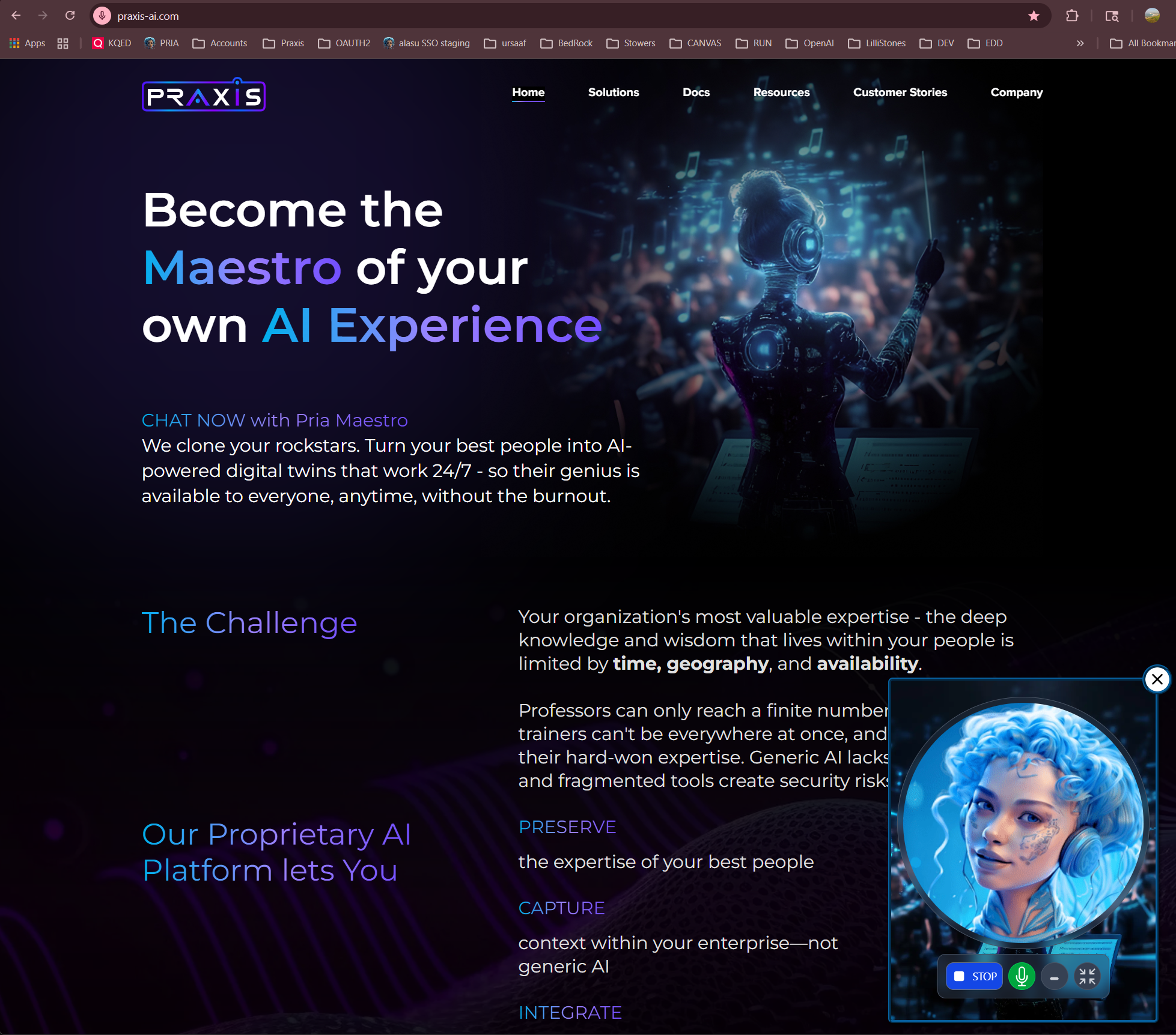
One Platform. Any AI Model. Your Digital Twin.
Most AI tools give you a chatbot. Praxis gives you a Digital Twin — an intelligent, always-available extension of your organization that speaks your language, knows your content, uses your tools, and sounds like you. Built as AI middleware, Praxis sits between your organization and the AI models you choose. You bring the knowledge, personality, and branding. We handle the infrastructure — from voice cloning to document intelligence, from Google Workspace automation to LMS integration.Already using ChatGPT, Claude, or Gemini? Praxis doesn’t replace them — it gives you 90+ models from every major provider, all in one place, all trained on your content. Switch models anytime. No vendor lock-in. Ever.
Why Digital Twins?
The question isn’t whether AI can help your organization. It’s whether your AI actually knows your organization.They Know What You Know
Upload documents, manuals, course materials, or policies to the IP Vault. Your Digital Twin answers from your knowledge — not generic internet content. Retrieval-Augmented Generation (RAG) ensures every response is grounded in your source material.
They Sound Like You
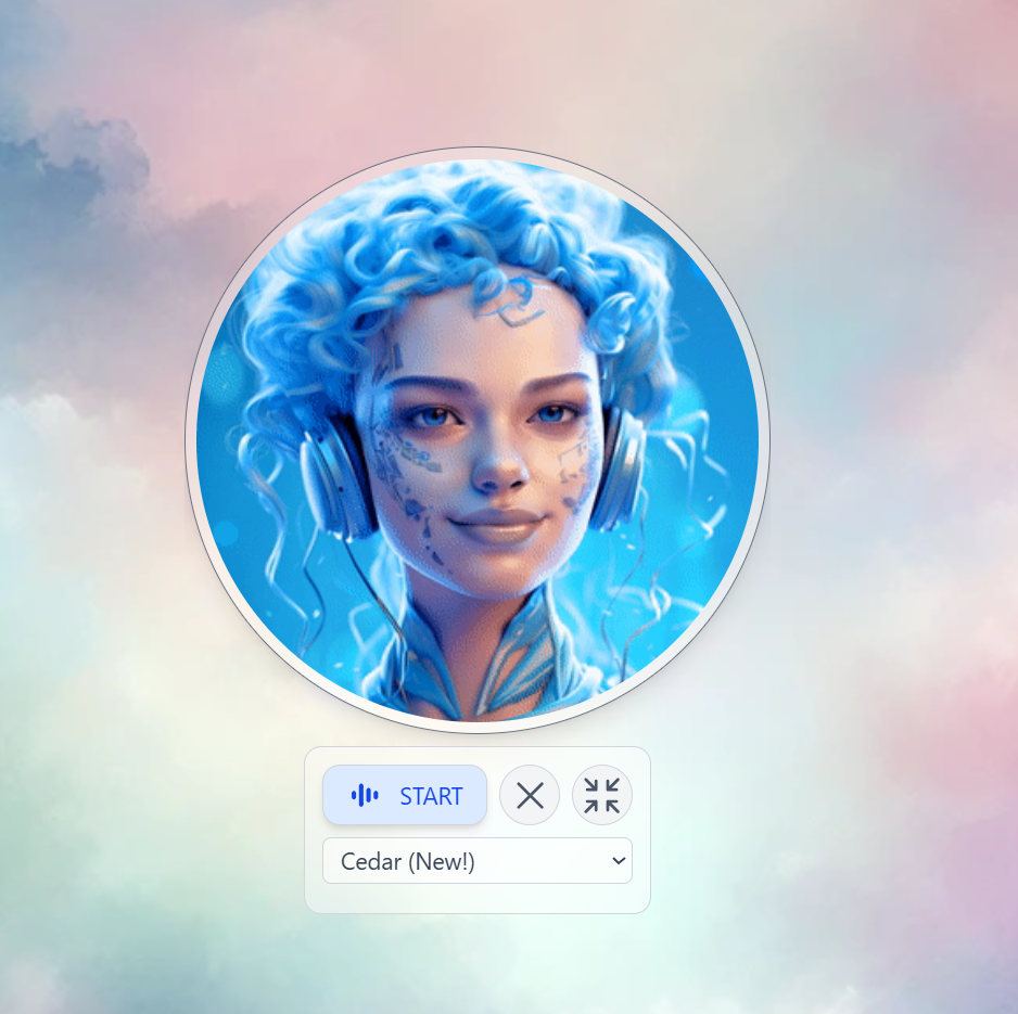
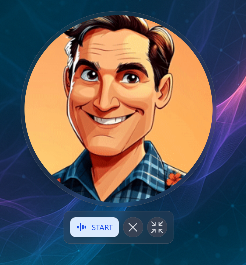
Give your Digital Twin a cloned voice powered by ElevenLabs. Hold real-time voice conversations in 99+ languages with a Twin that doesn’t just think like your organization — it sounds like it too.
They Never Clock Out
A Digital Twin is available 24/7, in every timezone, in any language. Whether a student needs tutoring at midnight or an employee needs onboarding guidance on a weekend — your Twin is ready.
Choose Any AI. Keep All of Them.
Praxis is the only platform that gives you unified access to 90+ AI models across every major provider — through a single interface, a single API, and a single knowledge base.- Amazon Bedrock
- OpenAI
- Anthropic
- Google Gemini
Claude (Opus, Sonnet, Haiku), Amazon Nova, Meta Llama 4, Mistral, Cohere Command — all accessed through your own AWS account with full data sovereignty.
No vendor lock-in. Switch models per conversation, per assistant, or per institution. Your knowledge base, tools, and configurations stay the same regardless of which AI powers the response.
Your Twin Works Where You Work
Digital Twins don’t live in a silo. They connect to the tools your team already uses — and act on them.Google Workspace
Gmail, Drive, Calendar, Sheets, Docs, Slides, Classroom, Meet, Maps — your Twin reads emails, schedules meetings, searches files, grades assignments, and manages documents. All through natural conversation.
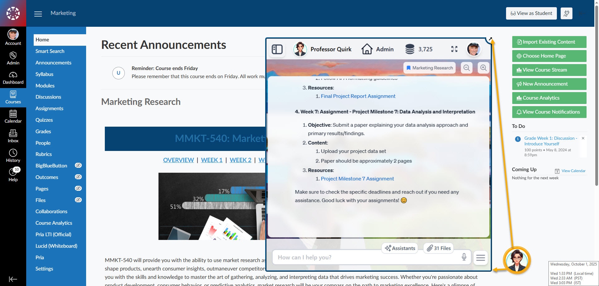
LMS Platforms
Native LTI 1.3 integration with Canvas, Moodle, Blackboard, Brightspace, and Schoology. Students and faculty access Digital Twins seamlessly from within their LMS — single sign-on, course context, and role-based access included.
Web & Mobile
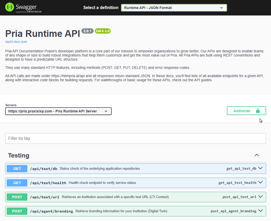
Embed Twins in any web application with the JavaScript SDK. Access them on the go with the Pria phone app. Or build entirely custom experiences with the REST API.
MCP Protocol
Expose your Twin as an MCP server for Claude Desktop, Cursor, or any MCP-compatible client. Your Twin’s knowledge becomes accessible to every tool in your AI workflow.
Chat Completions API
Drop-in OpenAI-compatible endpoint. Any app that works with the OpenAI SDK works with your Digital Twin — instantly.
Twin-to-Twin
Connect Digital Twins together. A sales Twin can query the product knowledge Twin. A student Twin can tap into the research Twin. No data duplication — live, real-time queries.
Talk to Your Twin
Two world-class voice providers. Real-time conversations in 99+ languages. Tool execution mid-conversation. And yes — your Twin can sound exactly like you.OpenAI GPT-Realtime
Ultra-low-latency voice with 10+ built-in voices, full tool calling during conversations, and MCP server access. Your Twin can search documents, check calendars, and send emails — all while you talk.
ElevenLabs Voice Cloning
Clone any voice for a branded experience. Your Digital Twin speaks with the voice of your CEO, your professor, your brand ambassador. Dynamic context injection ensures every response is personalized.
- Real-time Voice
- Voice Cloning
What Can Your Digital Twin Do?
Answer from Your Knowledge Base
Answer from Your Knowledge Base
Upload documents, manuals, research papers, or course materials to the IP Vault. Your Twin uses Retrieval-Augmented Generation to answer from your content — with citations and source links.
Manage Your Google Workspace
Manage Your Google Workspace
Send emails, schedule meetings, search Drive files, read spreadsheets, access Classroom data — all through conversation. Your Twin handles the complexity of Google APIs so you don’t have to.
Research & Analysis
Research & Analysis
Web search, academic paper search (Google Scholar, PubMed, NIH), patent databases, and Wolfram Alpha computations — all available as built-in tools your Twin can use mid-conversation.
Create Images & Analyze Media
Create Images & Analyze Media
Generate images with DALL-E 3 or Amazon Nova Canvas. Analyze uploaded images, charts, or screenshots with vision models. Transcribe audio and video files — with speaker identification.
Remember & Learn
Remember & Learn
Personal Memory learns your preferences, projects, and working style across sessions and devices. Shared Memory creates a team-wide knowledge base that every user of a Twin can contribute to and access.
Automate LMS Workflows
Automate LMS Workflows
For Canvas users: grade assignments, monitor class health, identify at-risk students, analyze participation — all through pre-built assistants or natural conversation with your Twin.
Assistants & 28+ Built-in Tools
Assistants & 28+ Built-in Tools
Your Digital Twin defines who your AI is — its personality, knowledge, and voice. Assistants define what it can do. Each assistant is a specialized skill that orchestrates Pria’s 28+ built-in tools — web search, Google Scholar, Wolfram Alpha, DALL-E, Canvas LMS, Google Workspace, memory management, code execution, and more — into repeatable, agentic workflows.Create assistants for any task: a Research Assistant that searches scholarly databases, synthesizes findings, and formats citations. A Report Generator that pulls data from your Vault and builds structured summaries. A Socratic Tutor that guides students through problems step by step. Each one runs autonomously, chaining tools together to deliver results — not just answers.
Platform at a Glance
- Digital Twin Gallery
- Voice Conversations
- LMS Integration
- Web Agents
- REST APIs & SDK
Create, manage, and switch between Digital Twins from a single dashboard. Each Twin has its own personality, knowledge base, tools, and branding. Invite users, manage access, and track usage.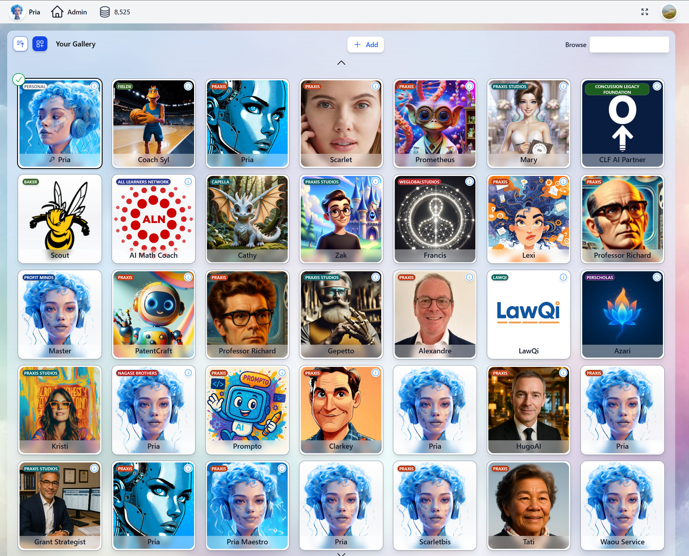
Built for Every Team
Education
Deploy AI tutors that speak your students’ language — literally. LTI integration, Canvas tools, assignment grading, class health monitoring, and FERPA-compliant data handling. Students get personalized coaching 24/7 without adding to faculty workload.
Enterprise
Scale institutional knowledge without scaling headcount. White-label branding, multi-tenant architecture, role-based access, and full audit trails. Onboard employees, automate support, and centralize expertise in Digital Twins that never forget.
Developers
REST APIs, JavaScript SDK, OpenAI-compatible Chat Completions, and MCP protocol support. Embed Digital Twins in any application, connect them to any AI workflow, or build entirely new experiences on top of the platform.
Customer Experience
Voice-enabled Digital Twins with cloned voices for branded customer interactions. Real-time tool execution during conversations. Your Twin doesn’t just answer questions — it takes action on behalf of your customers.
Enterprise-Grade From Day One
99+ Languages
Speak, read, and interact in any language — with real-time voice in all of them.
Always On
24/7 availability with instant, consistent responses. No sick days, no timezones, no wait times.
Your Knowledge
RAG-powered answers from your documents, not generic internet content. Citations included.
Secure & Compliant
SOC 2, FERPA, COPPA compliant. Bank-level encryption. Role-based access. Full audit trails.
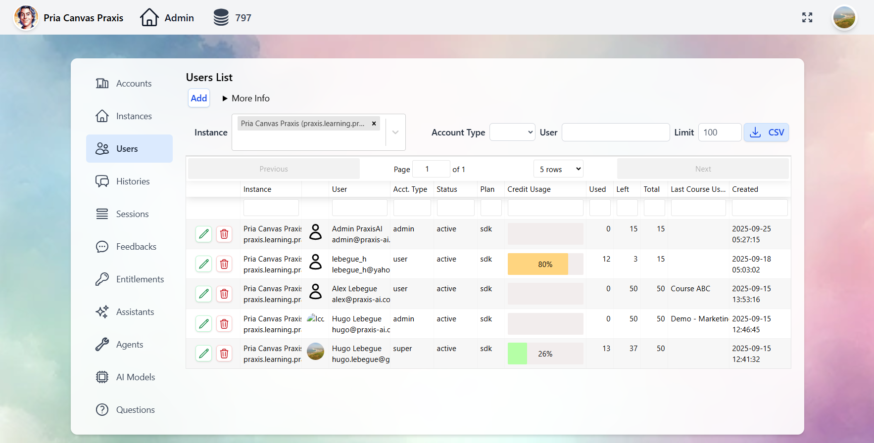
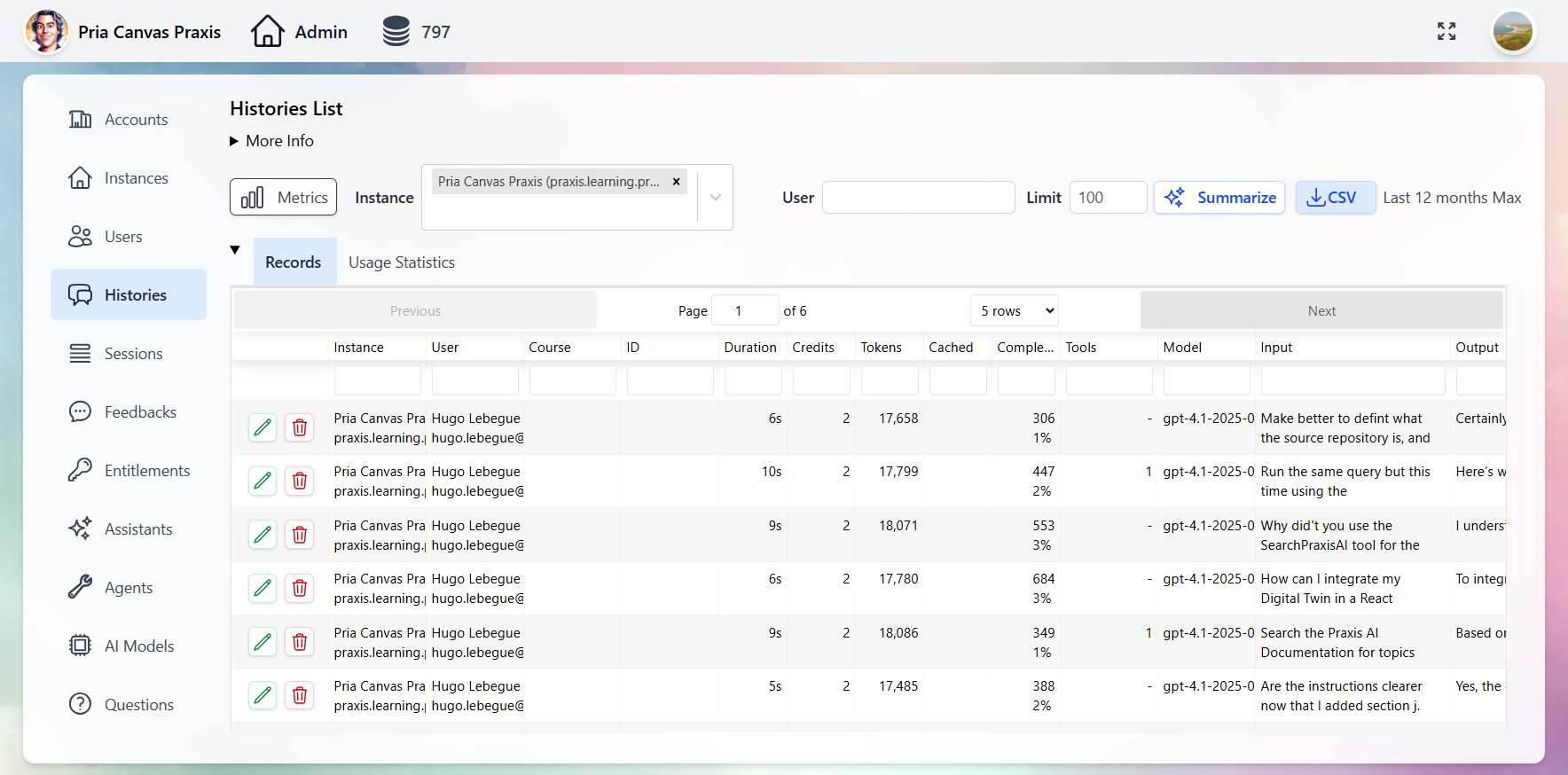
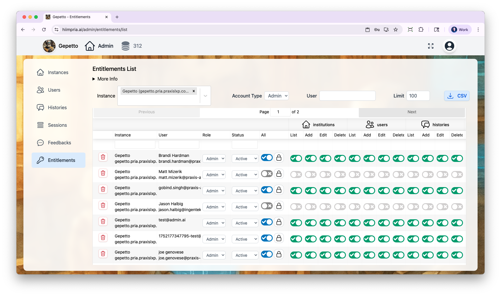
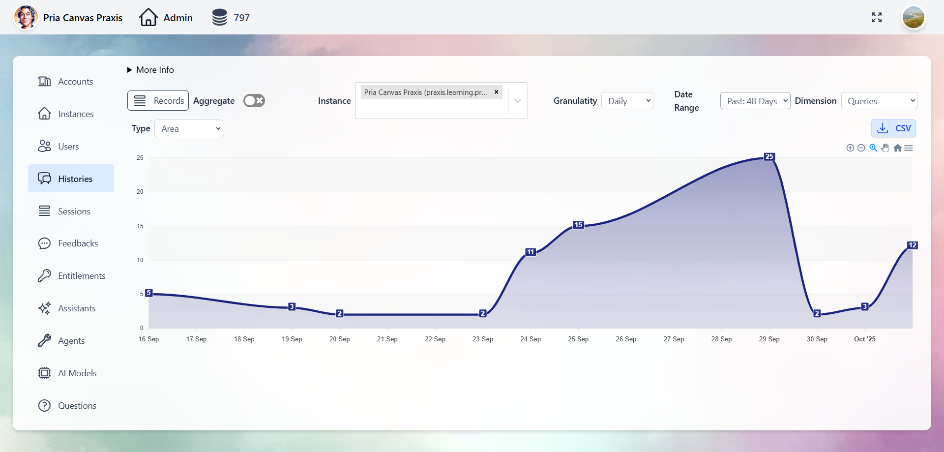
Administration & Analytics
Full control over Digital Twins, users, conversations, and analytics through the Administrative Panel.- Digital Twins
- Users
- Conversations
- Entitlements
- Analytics
Manage every Twin: AI model selection, tool permissions, knowledge bases, branding, and user access.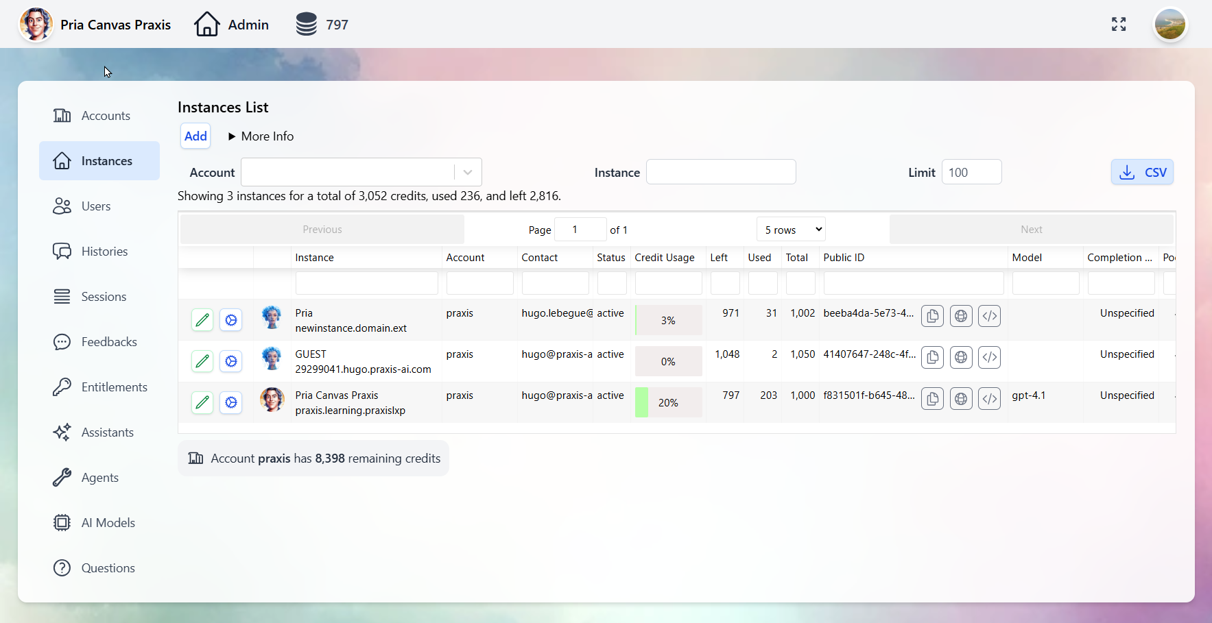
Customize your Twins with your institution’s branding — logos, colors, and welcome screens. See the Personalization guide.
How It All Fits Together
Create Your Digital Twin
Ready to build yours? Choose the path that fits your team:We Build It For You
Complete a quick form and our team handles everything — your Digital Twin will be ready in 24-48 hours. Perfect for organizations that want expert setup.
Build It Yourself
Sign up, answer a few onboarding questions, and start using your Digital Twin in 10-20 minutes. Full control from day one.
Complete Creation Guide
See the full step-by-step guide for all creation options →
Explore the Platform
Using the Interface
Learn how to communicate with your Digital Twin effectively.
Voice Conversations
Set up real-time voice with OpenAI or ElevenLabs voice cloning.
Create Assistants
Build custom assistants to automate workflows and specialize your Twin.
IP Vault & RAG
Train your Digital Twin on your proprietary documents and content.
Google Workspace
Connect Gmail, Drive, Calendar, Sheets, Classroom, and more.
Memory Systems
Personal memory, shared memory, and conversation history explained.
Plans & Pricing
Individual plans from free trials to enterprise tiers with volume savings.
All Integrations
LMS, Web SDK, MCP, Chat Completions, ElevenLabs, and REST APIs.