You can further customize your instance by applying a CSS theme to your instance.
This enables you to change backgrounds, colors, sizes, and layouts across the entire digital twin UI.
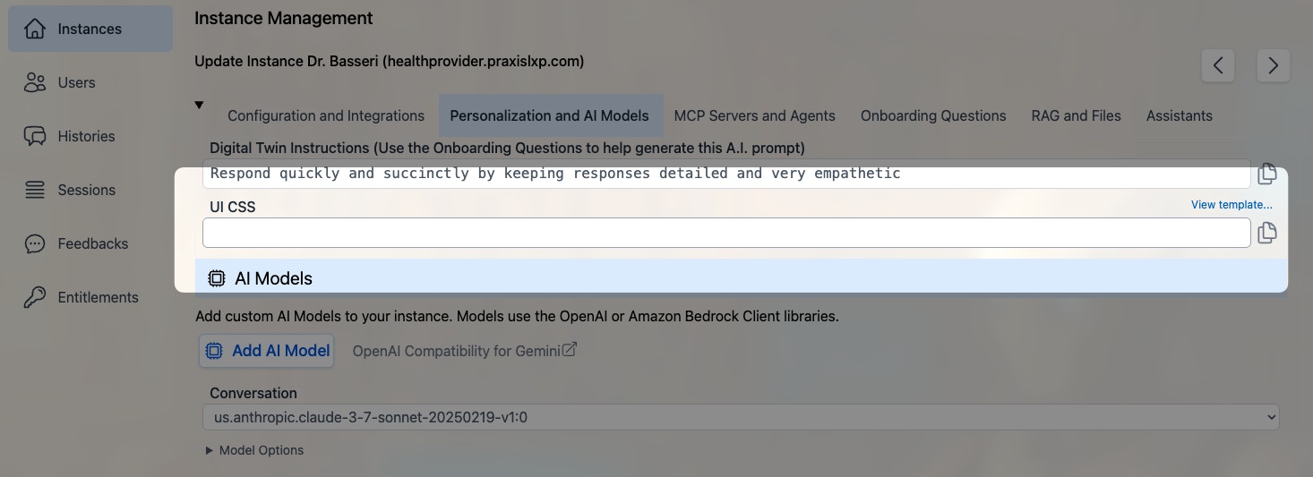
Under the Personalization and AI Models tab in your admin dashboard, you will find the UI CSS field.
 The starter template CSS file is available using this link:
https://pria.praxislxp.com/pria-ui-template.css
Copy its content into the CSS field, and click Update to save.
The starter template CSS file is available using this link:
https://pria.praxislxp.com/pria-ui-template.css
Copy its content into the CSS field, and click Update to save.
Responsive Breakpoints
When writing custom CSS, use the following media queries for responsive layouts:
max-sm   @media not all and (min-width: 640px)  { ... }
max-md   @media not all and (min-width: 768px)  { ... }
max-lg   @media not all and (min-width: 1024px) { ... }
max-xl   @media not all and (min-width: 1280px) { ... }
max-2xl  @media not all and (min-width: 1536px) { ... }
CSS Class Reference
Every customizable CSS class available in the Pria UI, organized by section.
Global
| Class | Used In | Purpose |
|---|
.pria-ui-background | Main layout | Root background container for the entire application |
.pria-ui-template | Admin settings | Reference to the CSS template file (link in admin UI) |
Top Navigation Bar
| Class | Used In | Purpose |
|---|
.pria-ui-topbar | Top bar | Main navigation bar across the top of the screen |
.pria-ui-top-btn | Top bar | Individual navigation buttons (Home, Admin, Credits, etc.) |
.pria-ui-favorites-bar | Top bar | Horizontal scrollable bar of favorite institution shortcuts |
.pria-top-navigation-menu | Top bar | Profile dropdown menu that appears when clicking the user avatar |
| Class | Used In | Purpose |
|---|
.pria-ui-sidebar | Sidebar | Left sidebar panel listing conversations |
.pria-ui-sidebar-close | Sidebar | Close button to collapse the sidebar |
.pria-ui-sidebar-search | Sidebar | Search input field for filtering conversations |
.pria-ui-conversation-current | Sidebar | Highlight style on the currently active conversation |
.pria-ui-course-name | Message headers | Inline display showing the conversation/course name with bookmark icon |
Main Content Area
| Class | Used In | Purpose |
|---|
.pria-ui-main | Main panel | Primary content area to the right of the sidebar |
.pria-ui-messages | Messages | Scrollable container holding all conversation messages |
Messages
| Class | Used In | Purpose |
|---|
.pria-ui-message | Messages | Wrapper for an individual message (input + output pair) |
.pria-message-in | Messages | User’s input message text block |
.pria-message-out | Messages | AI’s output message text block |
.pria-ui-input-icon | Messages | Container for the user avatar icon beside input messages |
.pria-ui-output-icon | Messages | Container for the AI/assistant avatar icon beside output messages |
.pria-ui-assistant-name | Message headers | Inline display of assistant name with sparkles icon |
.pria-ui-dialogue-created | Message headers | Expandable timestamp showing when the dialog was created |
.pria-ui-dialogue-favorite | Message headers | Star button to toggle a dialog as favorite |
.pria-ui-dialog-infocard | Messages | Hover card showing dialog metadata (tokens, credits, duration) |
| Class | Used In | Purpose |
|---|
.pria-message-tools | Message toolbar | Outer container for the per-message action bar |
.pria-ui-tools-btn | Message toolbar | Base class on every tool button (share, view, delete, copy) |
.pria-ui-tools-tooltip | Message toolbar | Tooltip label that appears on hover above each button |
.pria-ui-tools-check | Message toolbar | Checkmark icon shown briefly after a successful copy |
.pria-ui-tools-share-btn | Message toolbar | Share Link button wrapper |
.pria-ui-tools-share | Message toolbar | Share Link icon |
.pria-ui-tools-view-btn | Message toolbar | View Details button wrapper |
.pria-ui-tools-view | Message toolbar | View Details icon |
.pria-ui-tools-delete-btn | Message toolbar | Delete Dialog button wrapper |
.pria-ui-tools-delete | Message toolbar | Delete / Recover icon |
.pria-ui-tools-copyinput-btn | Message toolbar | Copy Input button wrapper |
.pria-ui-tools-copyinput | Message toolbar | Copy Input icon |
.pria-ui-tools-copyoutput-btn | Message toolbar | Copy Output button wrapper |
.pria-ui-tools-copyoutput | Message toolbar | Copy Output icon |
.pria-ui-tools-confirm | Message toolbar | Delete confirmation bar (are you sure?) |
.pria-ui-tools-confirm-yes | Message toolbar | Confirm delete button |
.pria-ui-tools-confirm-cancel | Message toolbar | Cancel delete button |
Text-to-Speech
| Class | Used In | Purpose |
|---|
.pria-ui-tools-tts | Message toolbar | Wrapper for all TTS controls |
.pria-ui-tools-speak | Message toolbar | Speak button (starts text-to-speech) |
.pria-ui-tools-speak-icon | Message toolbar | Speaker icon inside the Speak button |
.pria-ui-tools-stop | Message toolbar | Stop button (stops playback) |
.pria-ui-tools-stop-icon | Message toolbar | Stop icon inside the Stop button |
.pria-ui-tools-voice | Message toolbar | Voice selector button |
.pria-ui-tools-voice-icon | Message toolbar | Music note icon inside the Voice button |
.pria-ui-tools-voice-name | Message toolbar | Voice name label (hidden on small screens) |
| Class | Used In | Purpose |
|---|
.pria-ui-input | Input area | Main input section at the bottom of the conversation |
.pria-ui-entrysearch | Input area | The text input/search field where users type messages |
.pria-ui-tb-btn | Input toolbar | Toolbar buttons below the input (send, attach, etc.) |
.pria-ui-dictate-btn | Input area | Microphone button for voice input/dictation |
.pria-ui-input-options | Input area | Collapsible container for input options (file upload, paste, etc.) |
.pria-ui-embed-uploads | Input area | Drag-and-drop upload area showing dropped files/URLs |
Streaming / Live Response
| Class | Used In | Purpose |
|---|
.pria-ui-stream-message | Streaming | Wrapper for the entire streaming message display |
.pria-ui-stream-controls | Streaming | Container for streaming control buttons (abort, pause) |
.pria-ui-rtstream | Streaming | Real-time audio stream container for live conversation |
.pria-ui-rtstream-icon | Streaming | Pulsing status indicator icon during active RT audio stream |
Welcome Screen
| Class | Used In | Purpose |
|---|
.pria-ui-welcome | Welcome | Welcome screen displayed when no conversation is active |
.pria-ui-welcome-options | Welcome | Suggested prompt buttons/options on the welcome screen |
Zoom Controls
| Class | Used In | Purpose |
|---|
.pria-ui-zoomin | Messages | Zoom in button for message text size |
.pria-ui-zoomout | Messages | Zoom out button for message text size |
Assistants
| Class | Used In | Purpose |
|---|
.pria-ui-assistants | Assistants panel | Outer container for the assistants section |
.pria-ui-assistants-list | Assistants panel | Responsive grid container for displaying assistant cards |
.pria-ui-assistant | Assistants panel | Individual assistant card |
.pria-ui-assistant.active | Assistants panel | Active (published and enabled) assistant card |
.pria-ui-assistant.inactive | Assistants panel | Inactive (disabled) assistant card |
.pria-ui-assistant.unpublished | Assistants panel | Unpublished (draft) assistant card |
.pria-ui-assistant-name | Message headers | Assistant name display with sparkles icon in message headers |
.pria-ui-assistant-badges | Assistants panel | Container for scope, status, and permission badges on assistant cards |
.pria-ui-assistant-actions | Assistants panel | Container for start/edit/delete action buttons on assistant cards |
.pria-ui-assistant-model | Assistants panel | Modal container for adding/editing assistant settings |
Voices / Language Selection
| Class | Used In | Purpose |
|---|
.pria-ui-voices | Voices panel | Container for voice selection options |
.pria-ui-languages-selection | Languages panel | Container for language/locale selection |
Files / Uploads
| Class | Used In | Purpose |
|---|
.pria-ui-files | Files panel | Outer container for the files section |
.pria-ui-files-sort | Files toolbar | Sort buttons (by name or date) in the files toolbar |
.pria-ui-file | Files panel | Individual file card |
.pria-ui-file.selected | Files panel | Currently selected file card |
.pria-ui-file.active | Files panel | Active (included in context) file card |
.pria-ui-file.inactive | Files panel | Inactive (excluded from context) file card |
.pria-ui-file.error | Files panel | File card in error state (failed processing) |
.pria-ui-collection | Files panel | Collection (folder) card in the files view |
.pria-ui-uploads | Files panel | Container for file upload area |
.pria-ui-vault-health-summary | Files panel | Stats chips showing total, included, and unused file counts |
Gallery (Digital Twins)
| Class | Used In | Purpose |
|---|
.pria-ui-gallery | Gallery | Outer container for the digital twins gallery |
.pria-ui-gallery-header | Gallery | Header section of the gallery |
.pria-ui-gallery-carousel | Gallery | Scrollable carousel of digital twin cards |
.pria-ui-gallery-card | Gallery | Individual digital twin card |
.pria-ui-gallery-card.selected | Gallery | Currently selected digital twin card |
Realtime / Conversation Mode
| Class | Used In | Purpose |
|---|
.pria-ui-rt-window | RT Audio | Draggable floating window for real-time audio conversation |
.pria-ui-convo-container | RT Audio | Inner circular container holding the animated avatar with status colors. Contains also contracted/expanded class |
.pria-ui-convo-tools | RT Audio | Bottom container holding the tools. Contains also contracted/expanded class |
.pria-ui-convo-avatar-image | RT Audio | The avatar image element inside the RT audio window |
.pria-ui-convo-tools-panel | RT Audio | Bottom tools panel inside the RT audio window |
.pria-ui-rt-idle | RT Audio | State class: no active audio (default) |
.pria-ui-rt-input-active | RT Audio | State class: user is speaking (mic input detected) |
.pria-ui-rt-output-active | RT Audio | State class: AI is speaking (audio output active) |
.pria-ui-rt-muted | RT Audio | State class: microphone is muted |
Pricing Page
| Class | Used In | Purpose |
|---|
.pria-ui-pricing-header | Pricing | Header section of the pricing page |
.pria-ui-pricing-container | Pricing | Main container for pricing plans |
.pria-ui-pricing-loading | Pricing | Loading state placeholder |
.pria-ui-pricing-modal | Pricing | Payment modal dialog |
.pria-ui-pricing-tabs | Pricing | Tab bar for switching between pricing views |
.pria-ui-pricing-actions | Pricing | Action buttons (subscribe, buy credits, etc.) |
.pria-ui-pricing-about-header | Pricing | Header for the “about” section |
.pria-ui-pricing-about | Pricing | About/description section on the pricing page |
.pria-ui-pricing-badges | Pricing | Badge display area on the pricing page |
| Class | Used In | Purpose |
|---|
.pria-ui-badge | Badges | Generic badge/tag element |
.pria-ui-badge-membership | Badges | Membership level badge |
.pria-ui-badge-role | Badges | User role badge |
.pria-ui-badge-credits | Badges | Credits count badge |
.pria-ui-badge-pool | Badges | Pool credits badge |
.pria-ui-badge-sharing | Badges | Sharing status badge |
Charts / Visualization
| Class | Used In | Purpose |
|---|
.pria-ui-chartcontainer | Charts | Container for chart/visualization components |
Admin Section
| Class | Used In | Purpose |
|---|
.pria-ui-wrapper | Admin | Outer wrapper for admin page content |
.pria-ui-tabpane | Admin | Content pane for admin tab sections |
.pria-ui-button-bar | Admin / Tabs | Horizontal tab bar or button group container |
Profile Section
| Class | Used In | Purpose |
|---|
.pria-ui-profile-header | Profile | Header section of the user profile page |
Feedback / Output
| Class | Used In | Purpose |
|---|
.pria-ui-feedback | Feedback | Container for the feedback/review section |
.pria-ui-output | Output | Generic output display container |
Error Display
| Class | Used In | Purpose |
|---|
.pria-ui-error | Error banner | Outer wrapper for error notification banners |
.pria-ui-error-inner | Error banner | Inner container with gradient background and border styling |
.pria-ui-error-icon | Error banner | Container for the error exclamation icon |
.pria-ui-error-message | Error banner | Text content area of the error message |
.pria-ui-error-dismiss | Error banner | Dismiss/close button to hide the error |
Collapsible Sections
| Class | Used In | Purpose |
|---|
.pria-ui-details | Collapsible | <details> element wrapper for expandable sections |
.pria-ui-summary | Collapsible | <summary> element (clickable header) for collapsible sections |
View-Specific Sections
| Class | Used In | Purpose |
|---|
.pria-ui-view-upload | Upload view | Container for the file upload management page |
.pria-ui-view-upload-inner | Upload view | Inner content area of the upload view |
.pria-ui-upload-top | Upload view | Top toolbar of the upload view |
.pria-ui-view-history | History view | Container for the conversation history page |
.pria-ui-view-history-inner | History view | Inner content area of the history view |
.pria-ui-view-history-inner-dialogues | History view | List of dialogues within a history conversation |
.pria-ui-tool-icon | History view | Icon for tool/function calls in history |
| Class | Used In | Purpose |
|---|
.pria-login-btn | Login page | Primary login button |
.pria-signup-btn | Login page | Sign-up / register button |
.pria-request-tojoin-cancel-btn | Login page | Cancel button on the “request to join” form |
.pria-request-tojoin-join-btn | Login page | Submit button on the “request to join” form |
Example: Halve the RT Audio Avatar
To resize the animated avatar in the real-time conversation window to half its default size, add this CSS to your institution’s custom CSS:
/* Shrink the RT conversation avatar to half size */
.pria-ui-convo-avatar-image {
    min-width: 10.25rem !important;
    min-height: 10.25rem !important;
}

.pria-ui-convo-container {
    width: 10.75rem !important;
    min-height: 10.75rem !important;
}
transform for a proportional scale that keeps everything aligned:
.pria-ui-convo-container {
    transform: scale(0.5);
    transform-origin: top right;
}
Example: Custom Background
Apply a radial gradient background across all major UI sections:
.pria-ui-topbar,
.pria-ui-sidebar,
.pria-ui-background,
.pria-ui-messages,
.pria-ui-input,
.pria-ui-profile-header,
.pria-ui-entrysearch,
.pria-ui-wrapper,
.pria-ui-tabpane,
.pria-ui-files,
.pria-ui-assistants,
.pria-ui-uploads,
.pria-ui-voices,
.pria-ui-chartcontainer,
.pria-ui-feedback,
.pria-ui-output,
.pria-ui-gallery,
.pria-ui-pricing-container {
    background: radial-gradient(circle, #FFFFE0, #fff7e6, #FFA500);
    background-size: cover;
    background-attachment: fixed;
}
Example: Custom Gallery Card Selection
.pria-ui-gallery-card.selected {
    border-color: #3b82f6 !important;
    box-shadow: 0 10px 25px -5px rgba(59, 130, 246, 0.3) !important;
}
Example: Custom File Card States
.pria-ui-file.selected {
    background-color: rgba(255, 255, 255, 0.75) !important;
}
.pria-ui-file.active {
    background-color: rgba(255, 255, 255, 0.5) !important;
}
.pria-ui-file.inactive {
    background-color: rgba(0, 255, 0, 0.1) !important;
}
.pria-ui-file.error {
    background-color: rgba(255, 0, 0, 0.1) !important;
}
We are actively working on creating a library of color templates to facilitate the selection. For any help modifying the CSS template, just ask Pria!